The hues welcoming in the new decade have a decidedly calm, organic feel to them.

This year we saw the shock of Living Coral. The year before, it was a pop of Ultra Violet. For 2020, Pantone’s Color of the Year will be...blue. Classic Blue, to be exact. Represented by the numbers 19-4052 in the company’s standardized color system, Classic Blue represents a turn away from shocking shades in favor of the color equivalent of comfort food.

Pantone’s explanation for its choice: Classic Blue instills calm, confidence, connection, "as well as a desire for a dependable and stable foundation on which to build as we enter a new era," the company said in a statement. Leatrice Eiseman, executive director of the Pantone Color Institute, went on to say, "We are living in a time that requires trust and faith. It is this kind of constancy and confidence expressed by Classic Blue."
Like clockwork, everyone jumped on this "new neutral" tone whether through expressing opinion or spotlighting projects that don it. If you’ve heard or read any of the commentary, you’ll start to discern a pattern.

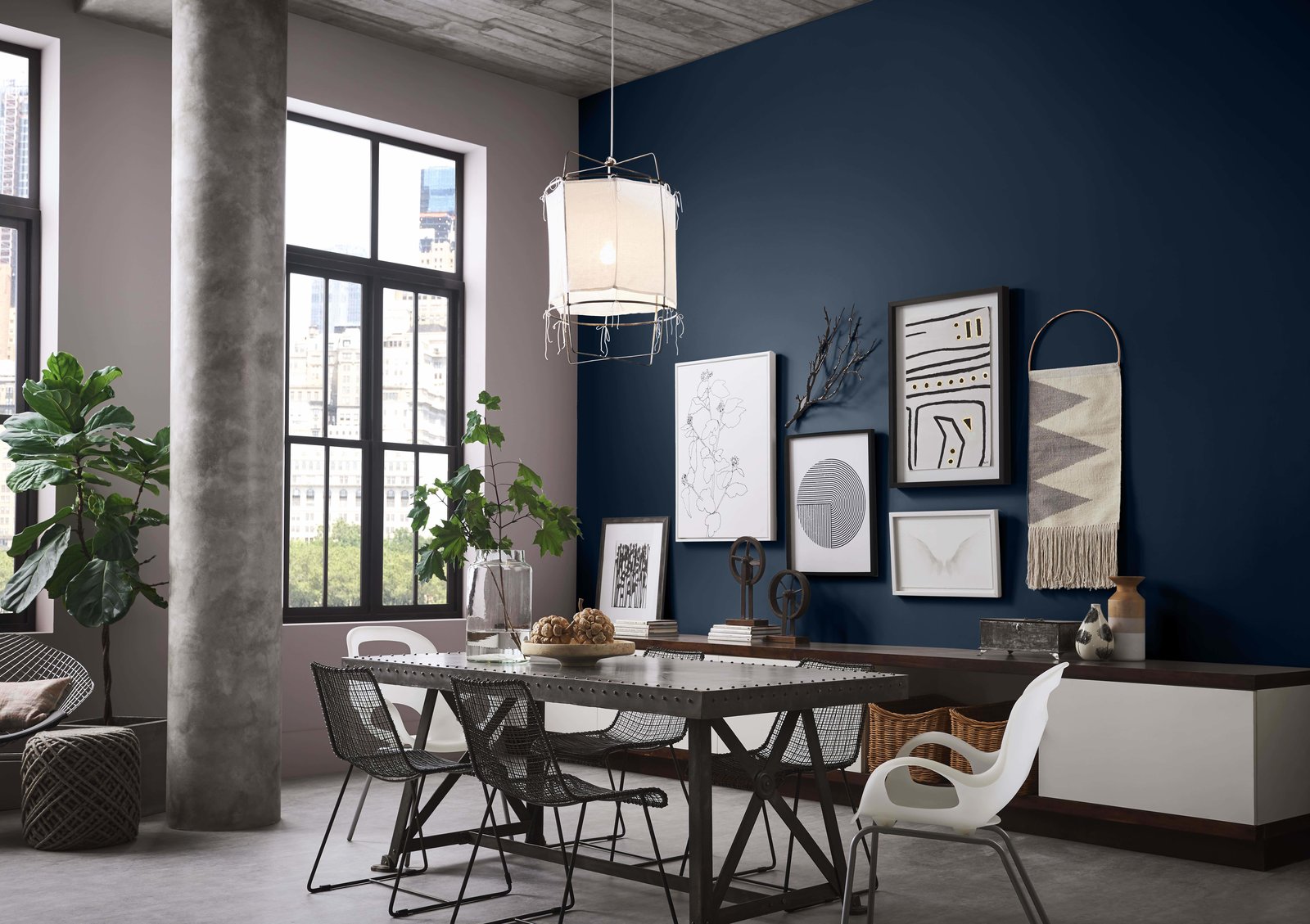
Sue Wadden, director of color marketing at Sherwin-Williams—who, coincidentally, selected Naval blue (SW 6244) as its color of the year back in September—concurs. "We’re on the same page as Pantone for 2020. [Blues] are poised to carry us into the next decade," Wadden says. "Relaxing, assuring shades of navy add a calm confidence to any space of the home."

See the full story on Dwell.com: Trend Report: Colors of 2020
Related stories:

No comments:
Post a Comment