Real estate agent Nicole Reber unpacks what questions to ask if you’re considering purchasing—including whether it might be better to just keep renting in the current market.
Welcome to Ask a Realtor, an advice column about the ins and outs of home finding, renting, buying, and selling from expert Douglas Elliman real estate agent Nicole Reber. Have a question? Submit it here.
Q: First-time homebuyer here. I haven’t bought yet, but I’m not sure if I can even afford anything these days. What advice would you give me (40 years old, partnered, no kids, no pets) if I want to buy in a large or medium-size city (L.A., NYC, and surrounding areas) or places like Tucson—i.e., smaller cities closer to bigger cities? What questions do I need to be asking? Are there special loans for first-time homebuyers? Anything else that can help first-timers in this political climate (poor stock market, etc.)? What do interest rates mean for home-buying? Is now a bad time to buy? Should I just rent the rest of my life?
A: Hi reader, first off, you’re definitely not alone in these feelings. I’ve found that with clients who have many of these same questions, breaking things down one by one and getting really concrete with the numbers can help make these big decisions feel easier to make. I’ve always found that numerical clarity can help center the conversation and make it clear whether the highest-driving factor for your decision-making is emotion or logic—and then, of course, where to go from there.
As a first-time homebuyer, what questions do I need to be asking?
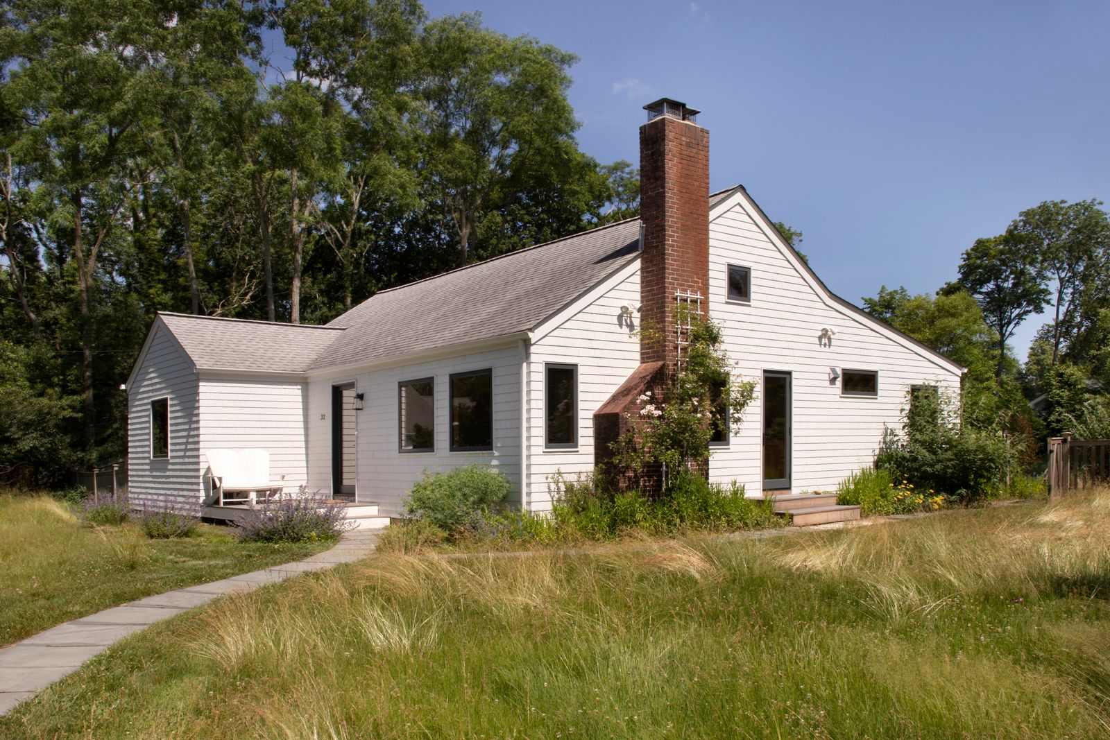
It’s hard to predict the future, but the length of time that you stay in your home can have a direct effect on the equity you may gain while living in your property. Being as realistic as possible about how long you’d plan to live in the house you purchase will help with making the numbers make sense when investing in property. In the U.S., the average homeowner now stays in their home for around 12 years, though that varies dramatically depending on the market. Los Angeles, for example, has one of the longest homeowner tenures in the country at roughly 20 years, which helps explain why inventory can feel especially tight there. Manhattan homeowners, by comparison, average closer to 10.5 years before selling. In places like Tucson, where housing inventory has become somewhat more balanced and prices remain significantly lower than larger U.S. cities, you may find a different mix of affordability, competition, and flexibility to choose between available properties in a price range based on each neighborhood in the city.
I find that it’s helpful to think about your movement patterns thus far in your life to see how long you would be comfortable committing to owning the house to ensure (to the best of your ability) it’d be a positive investment. While many conventional mortgages are structured as 15- or 30-year repayment plans, most people don’t actually stay in the same home long enough to fully pay off the loan before selling, refinancing, or moving. The longer you stay, the more opportunity you may have to build equity and offset the upfront costs of buying and selling. Knowing this can also give context to how often homes may come on the market in the cities you’re considering. Are you the type of person that has stayed in your apartment or city for long stretches of time? That can make deciding whether to commit to a purchase easier.
When it comes to the larger U.S. cities, the entry and carrying costs—like the cost of the down payment for your mortgage, taxes, insurance, and upkeep—can often be the biggest hurdles, and with those higher average price points, it just becomes more expensive to live. However, some of those larger cities can often have a faster value appreciation because of the tight supply of available homes for purchase driving up the price. You may be more focused on appreciation potential or more interested in finding a place you can comfortably settle into for a longer period of time. Understanding which priority matters more to you can help narrow down the markets that make the most sense to explore.
Still, I always think it’s a good idea to reach out to a real estate agent to have them do an analysis of the places you’re considering to get a sense of how the prices of the properties have increased in the past few years (while acknowledging that the pandemic saw one of the fastest periods of appreciation ever recorded). Appreciation is often neighborhood-specific as well, so be sure to ask them where they’ve seen the biggest changes and see if that aligns with where you might want to live in that city. For the smaller cities near the larger hubs, you may have lower purchase prices and more space. By speaking to real estate agents local to the market you’re looking to buy in, you can potentially uncover a place that can be a great fit for your desired lifestyle and work with your budget that could also be on a popularity precipice.
Are there special loans these days for first-time homebuyers?
Most incentives are localized to a state and local city when it comes to first-time homebuyers. The Federal Housing Administration (FHA), U.S. Department of Veterans Affairs (VA), and Federal National Mortgage Association (aka Fannie Mae) may also have loan programs that can help reduce the amount of the down payment costs you have to come to the table with. In my experience, your best bet is opening up a dialogue with a few different lenders to get a sense of the possibility of what programs you have available to see if something can align for your budget.
What do interest rates mean for home-buying? Anything else that can help first-timers?
Interest rates determine the cost of borrowing money. When the rates are higher, your monthly payment goes up. However, when rates are at historic lows like they were in 2020 and 2021, you can also have more competition with multiple buyers bidding on the same properties. When the rates go up, that can sometimes cool competition as affordability can become harder for people. It’s always important to know that you do have the option to refinance the interest rate on your mortgage when the interest rates improve, so the monthly payments you initially sign up for can potentially be reduced down the line. That’s not often a scenario you’re going to find with a rental agreement.
Another thing to consider is the age of the properties that may be available in your price range. Renting may preserve flexibility and lower monthly pressure when you’re looking at purchasing properties that are older and may require larger cash reserves for any unexpected fixes that may come up.
If pricing and updates are your biggest concern and you’re willing to make compromises on those amenities to get into ownership, I’ve typically seen more ability to negotiate in November and December, as some people put their house searches on pause with the holidays. This is a great window to have more leverage despite whatever is happening economically during the rest of the year. Weather can also be a factor, depending on the seasonality of the city you’re considering purchasing in. Here in Los Angeles, I’ve seen a slowdown at the top of the summer season—late June through August—as people travel and are distracted with enjoying themselves. National holiday weekends are also micro windows that can sometimes work in your favor. In the past few years, there’s been a heavy pickup in showings and offers even in the first and second weeks of January, so making that move before the holidays can often leave you with less competition which can help with the pricing conversation.
Is now a bad time to buy? Should I just rent the rest of my life?
Ultimately, these decisions are often about timing and what makes you comfortable, but I think assuming that you can’t find a good deal solely based on reports of the broader real estate market landscape can lead to stagnation and regret. Be honest about what you’re willing to take on but don’t miss out on an opportunity that might be there after lingering on the market due to bad photos, longer days on market, or cosmetic things that you can easily fix. (Like not buying because you prefer hardwood floors over carpet—this happens too often!) Asking questions to licensed and trusted financial advisors can really help, especially around what monthly payment feels sustainable for your income, how much house you can realistically afford without becoming financially stretched, how long you’d likely need to stay in the home for buying to make sense, and whether buying would limit other financial goals like saving, investing, or maintaining an emergency fund. You don’t want to resent where you live just to potentially gain appreciation and equity, but knowing that you have that forced savings through equity once you do own a house is a great hedge against other inflationary costs. If circumstances change, you can potentially keep your home still and rent it out to someone, if you’re comfortable with that and focused on growing your equity.
Buying a home can still be a powerful financial tool, but it only works when the timing and numbers make sense for you personally. I think people sometimes put enormous pressure on themselves to make the "perfect" real estate decision, but life rarely works that way. Some people buy and stay for 20 years (hello, L.A.); some people rent happily and use the money they would have spent as homeowners on maintenance to be invested in other ways. The goal is finding a living situation that supports the life you actually want to live. Knowledge is power, so ask questions of professionals, analyze your past patterns and personal bandwidth, and allow yourself the space to make the decisions right for you.
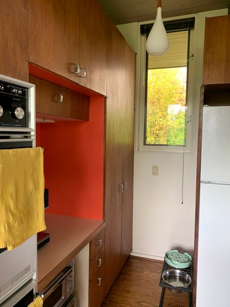
Top illustration by Ana Galvañ
---
Have a burning real estate question or want a realtor’s advice about the ins and outs of home finding, renting, buying, or selling? Ask our expert columnist!
Questions will be anonymized and may be edited for publication. Content shown in this column includes fact-specific advice, limited by the context given. We recommend consulting a licensed professional for your individual needs.
--
More Ask a Realtor stories:
What’s the Most Important Thing to Do to Prep My House for the Market?
I’m Selling a Niche Property. How Do I Find the Right Buyer?